There is no way to begin to describe the satisfaction I am deriving from my design courses right now. Today was our final critique day for Typography and Human Centered Design courses. We showed up to the type critique at 2:30 today and the professors and T.A.s had provided a feast because they knew that we have all been working so hard on these projects the last few weeks that we had likely skipped many meals. There are fifty students total in our group, half of us are leaning toward Industrial design, half toward graphic design, all VERY talented. The atmosphere in the room felt much more like we were graduating than just finishing a quarter in our sophomore year. People were hugging, laughing and taking photos together. The demands placed on us this quarter have really unified us as a force to be reckoned with in the design world and there is a very vibrant dynamic growing in our group.
The design program at UW has undergone some drastic changes in the past few years, including a complete retooling of the I.D. program. It is interesting to me how much we are gaining strength individually, but AMAZING to me how we are progressing as a group, UW Designers 2010. The environment is so electric that I often feel I am living what it must have been like to practice at the Bauhaus, or being in the company of the dadaists or among the great minds of De Stijl. On the drive home today I was overwhelmed with the creative energy fueled by the passion of my peers.
Anyway, my final typography project included a simple portfolio of all my work for the quarter and a 3-D project involving packaging design. We had to take our favorite coffee and redesign the packaging. I did not use a brand name in my project because it was not really the focus.
Here is my solution:
Now, on to my favorite project so far.
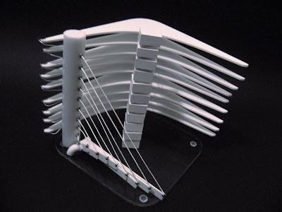
For our Human Centered Design course we had to develop a "Visual Identity Cube." Basically, each three person group had to select a person(designer, artist, architect, etc.), company, art movement, or anything that has a really distinct visual identity. We were then to develop a cube measuring approximately seven inches on each side that best represented the visual identity of whatever subject we had selected.
My group chose the great architect Santiago Calatrava to focus on. His work has only recently begun to pop up in the States with the Milwaukee Art Museum and a tower in Chicago that is currently under construction that will dwarf the Sears Tower. His sculptures and buildings take much influence from natural structures and forms such as bird wings, the human body and others. Though I was not familiar with his work before this project, I had great personal interest in this particular aspect of his design aesthetic since the structures and systems I had studied in Biology class a couple years ago were what fascinated me and influenced my decision to switch from a science major to being a design student.
His structures also tend to exhibit a great deal of motion, both implied and actual. The natural forms, use of space and light, and aspects of motion were what we focused on while brainstorming ideas for the project. Our final solution not only implies motion but it actually moves, thanks to a system of laser-cut cams that we designed and implemented into the central column. It also interacts well with light, producing amazing shadows and reflections.
First, some examples of Calatrava's work:
Some brainstorming sketches studying our cube:
Our final cube:


